Why a Print Hides More Than a Dark Colour Does
Quick Answer: Opacity failure is visible because skin tone shows through as a smooth, continuous change in the fabric. A dark solid colour reduces contrast but keeps that smooth surface, so the change stays readable. A print breaks the surface into competing shapes, which disrupts the visual pattern your eye uses to detect sheerness — and it keeps working even after the fabric has thinned with wear.
You did the sensible thing and bought black. And in the wrong light, at the wrong angle, it still went sheer at the seat.
The person next to you in a loud patterned pair had exactly the same fabric weight and you could not tell at all.
That is not luck. Colour and pattern hide sheerness through completely different mechanisms, and only one of them survives the fabric getting older.
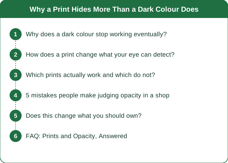
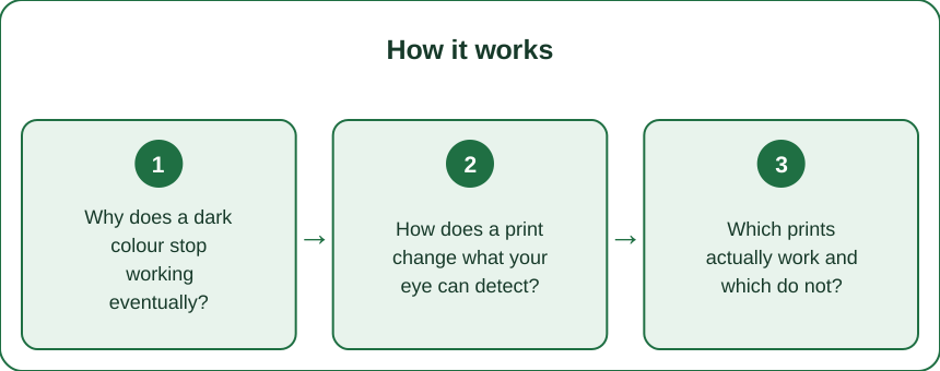
Why does a dark colour stop working eventually?
Because dark colour works by reducing contrast, and stretching reduces the colour.
When leggings stretch across the seat, the yarns spread apart and the fabric thins. Two things happen at once: more light passes through, and the dye that was concentrated in the fabric is now spread over a larger area, so the colour itself gets lighter.
Black stretched thin is not black. It is dark grey, and it is dark grey precisely in the area where light is now passing through.
So the mechanism that made black feel safe — high contrast between fabric and skin — degrades exactly where and when you need it. The stretched area is simultaneously more transparent and less dark.
There is a second problem specific to solids. Your eye is extremely good at detecting a smooth gradient. A solid colour surface is uniform, so any change reads immediately: a slightly lighter oval on a black surface is unmissable, even when the actual difference is small.
That is why the failure looks so stark. It is not that solid leggings go more sheer. It is that on a smooth uniform surface, a small amount of sheerness is highly visible.
How does a print change what your eye can detect?
It removes the uniform surface that makes sheerness readable.
A print puts competing shapes, edges and colours across the fabric. When a printed area stretches and thins, the change is still physically there — but your eye has no smooth baseline to compare it against.
Three specific effects:
1. Edge dominance. Your visual system prioritises hard edges over soft gradients. A print is full of hard edges, so the soft gradient of sheerness loses the competition for attention.
2. Colour variation. A print contains multiple tones. Skin showing through shifts the tone slightly — but on a surface that already contains several tones, a slight shift does not register as anomalous.
3. Distortion masking. Prints distort as they stretch, and that distortion is expected. On a solid, any visual change in the stretched area is unexplained and therefore noticeable. On a print, the eye attributes it to the stretch itself.
The practical result: a printed legging and a solid black legging of identical fabric can look very different under a squat, with the print consistently reading as more opaque.
And the important part: this advantage does not degrade with wear. As the fabric thins over months of washing, black gets progressively worse. The print keeps doing exactly what it was doing on day one.
Which prints actually work and which do not?
Not all prints are equal. Scale and contrast are what matter.
Works well:
- Small-to-medium busy prints — abstract marks, small florals, camo, animal prints, static or noise-style patterns. Maximum edge density, maximum masking.
- Multi-tonal prints with at least three distinguishable colours.
- Textural knits — ribbing, jacquard, seamless patterning. These are not prints but they work the same way, by breaking up the surface. Ribbing in particular is genuinely underrated for this.
- Marl and heather melange — the flecked look. Not a print at all, but the tonal variation does most of the same work.
Works poorly:
- Large-scale prints with big blocks of single colour. A large solid area behaves exactly like a solid legging.
- Ombré and gradient prints. These are smooth by definition, which is the thing you are trying to avoid.
- Two-tone prints in similar tones — not enough variation to mask anything.
- Prints only on the leg with a solid panel at the seat. Fairly common, and it puts a solid surface exactly where the problem is.
One caveat about light prints. A pale print on a light base still passes more light through overall. The masking helps, but a light print is not equivalent to a dark print. Busy and mid-to-dark toned is the reliable combination.

5 mistakes people make judging opacity in a shop
1. Checking in the changing room mirror only. Changing room lighting is usually overhead and diffuse, which is the most flattering possible condition. Real gym lighting is brighter and more directional.
2. Squatting facing the mirror. The failure area is the seat and back of the thigh. Facing the mirror shows you the one area least likely to be a problem. Turn around and look over your shoulder, or use a phone.
3. Doing one squat. Fabric behaves differently after it has been warmed and stretched a few times. Do five, then check. The fifth tells you more than the first.
4. Not checking under stretch and light together. The genuine test is stretch plus a light source behind or above you. A quick phone photo from behind with the changing room light overhead is the closest most people can get in a shop, and it is far more informative than the mirror.
5. Assuming a print excuses a bad fabric. This is the mistake to avoid after reading this article. A print masks a marginal fabric; it does not rescue a bad one. If the fabric is genuinely thin and stretched past its limit, a print buys you a little and no more.
The third one is the one that catches most people — a single squat in a shop tells you almost nothing about how the fabric behaves in the fifteenth minute of a class.
Does this change what you should own?
It changes the balance, not the whole wardrobe.
The sensible split for most people:
- Solid darks for the pieces you replace often and for lower-stakes wear where opacity is less critical.
- Busy prints or textured knits for the sessions where you are bending, lifting and being looked at from behind — class formats, group training, anything with mirrors.
- Ribbed or textured solids as the middle ground if you dislike prints. They give you a broken surface without a pattern.
The economic argument for prints is the one people miss. A solid black legging has a useful life defined by when the fabric thins enough to be visible. A printed legging of the same quality has a longer useful life, because the visual failure point arrives later than the physical one.
If you buy one pair at a time and wear them until they fail, the print is genuinely better value even at the same price.
A late-summer note: as studio lighting shifts back indoors and evening classes move under artificial light, opacity problems become more visible than they were under summer daylight. If a pair that was fine in July is suddenly failing, the fabric probably has not changed. The lighting has.
FAQ: Prints and Opacity, Answered
Are ribbed leggings really as good as prints for this?
Close, and sometimes better. Ribbing creates a repeating light-and-shadow pattern that masks sheerness well, and it is usually knitted at a higher density than flat fabric. The risk is that ribbing can thin dramatically at full stretch, so test it the same way.
Does washing fade a print the way it fades black?
Prints fade too, but the masking effect depends on pattern contrast rather than absolute darkness, so it survives fading better. A faded busy print still breaks up the surface.
Is white ever safe?
Rarely, in any pattern. White or very pale fabric passes the most light regardless of what is printed on it, and the contrast between fabric and skin is smallest. A busy print on white is better than plain white, but neither is a first choice for squats.
TL;DR:
- Dark solids work by reducing contrast, and that stops working as fabric stretches and thins — stretched black is grey.
- Prints work by breaking up the smooth surface your eye uses to detect sheerness, and that keeps working as the fabric ages.
- Choose small-to-medium busy prints, multi-tonal patterns, ribbing and marl; avoid large solid blocks, ombré and solid seat panels.
- Test with five squats, from behind, with a phone — not one squat facing a changing room mirror.
The takeaway is not to abandon black. It is to stop treating dark colour as the whole answer to opacity, because it is the mechanism that degrades fastest. If you are buying one pair to wear hard for a year, a busy print in a decent fabric will still be doing its job long after the equivalent black pair has quietly stopped.
See It in Motion
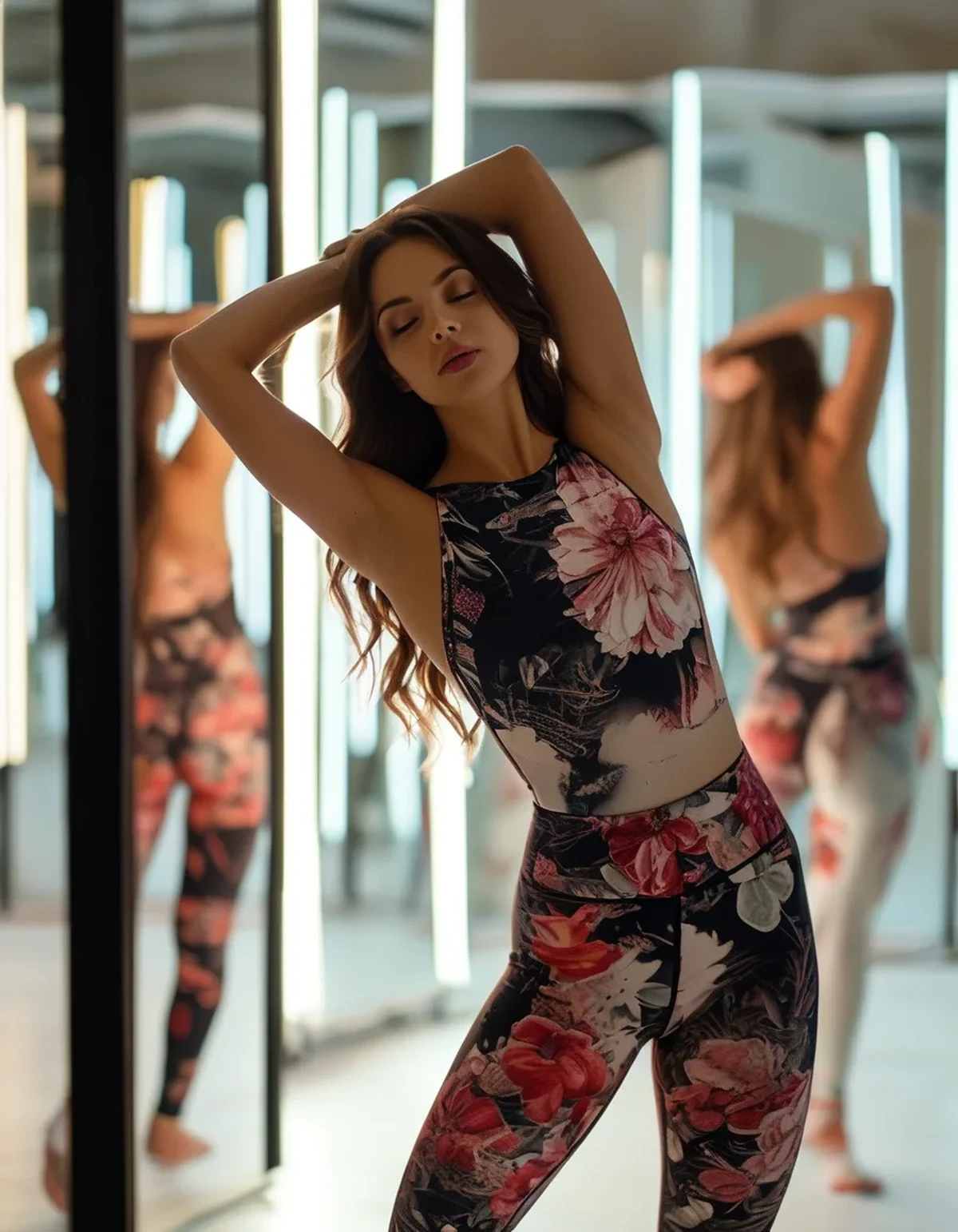
Seen here: Super High Waist Embossed Yoga Leggings with Inner Pocket — shop it on bubblelime.com
Keep Reading
This article is for general informational and styling purposes only. Fit, sizing, and product availability may vary.